
Pop Up in the Pines Brand Identity
Brand Strategy + Messaging
Brand Identity
Marketing Collateral
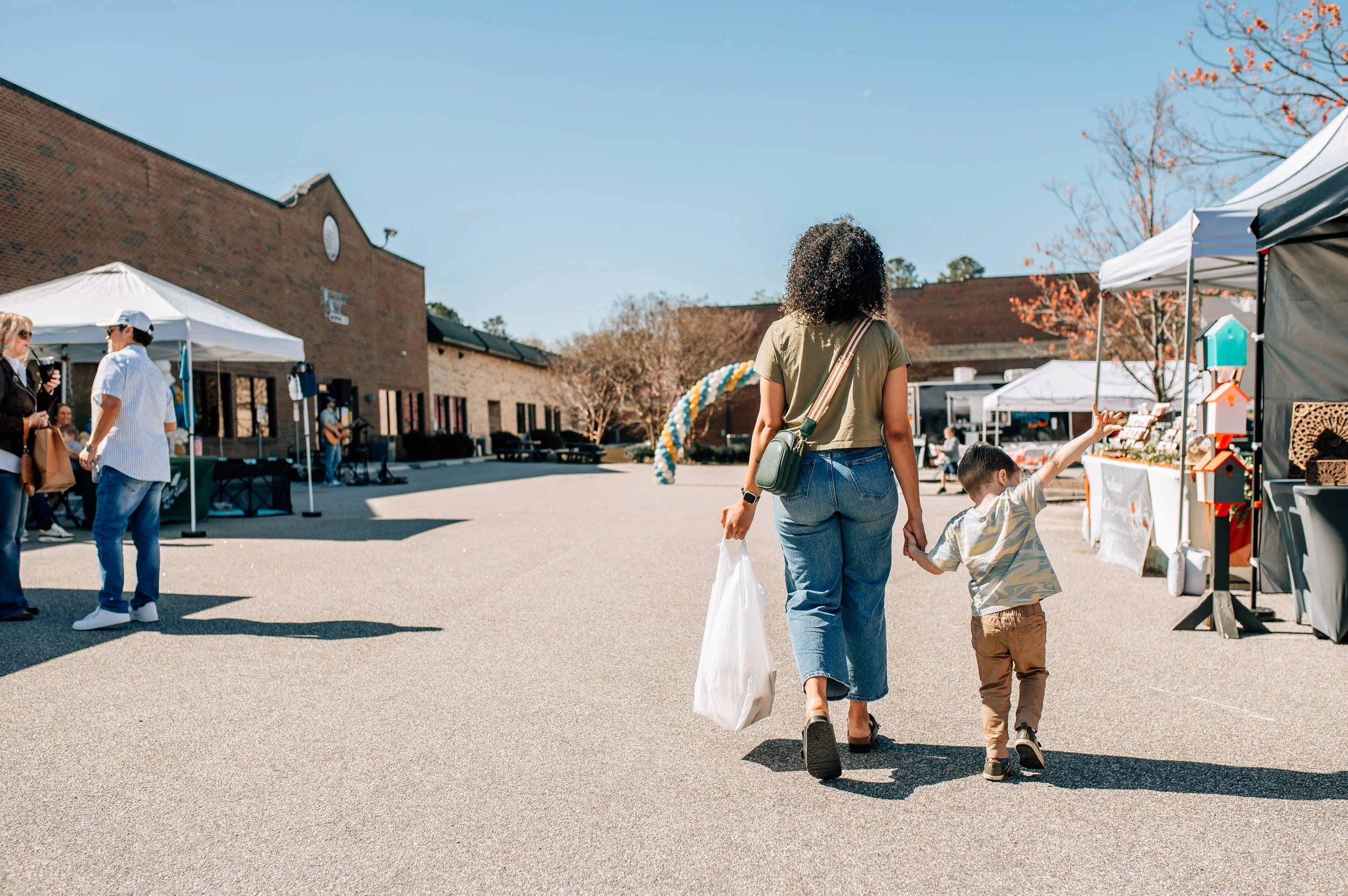
SCOPEOur client, Jillian, purchased a beloved maker's market with a loyal following and a community that genuinely showed up. But the brand looked like a DIY holdover from someone else's era. She had a much bigger vision and nothing to show for it visually. She was stuck explaining the potential to every vendor, rather than them seeing the value of joining in.
We built her a brand as warm and inviting as the pop-up markets, and within three months, she'd recouped her entire investment.
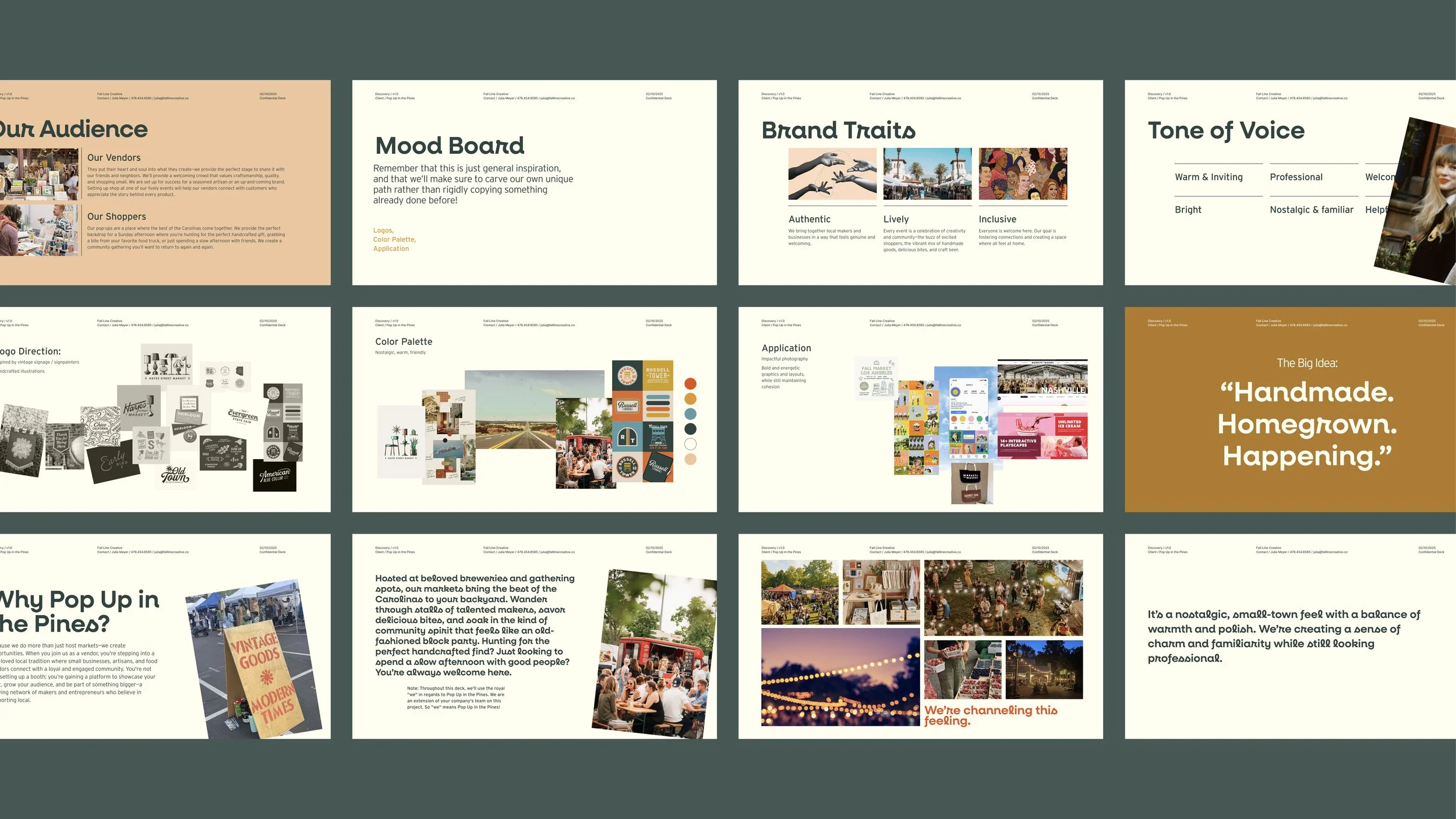
Brand Strategy & Positioning
We identified their core audiences: the seasoned artisan and the up-and-coming maker on one side, the intentional shopper and the Sunday afternoon wanderer on the other. We found that they both shared a belief in supporting local, a preference for story over commodity, and a love for the kind of gathering that feels like it's always been there.
The big idea that became their tagline: “Handmade. Homegrown. Happening.” does the work in three words. It signals authenticity without being precious about it, and energy without feeling corporate. The brand needed that same balance with enough nostalgia enough to make it feel familiar but polished enough to earn trust.

Visual Identity
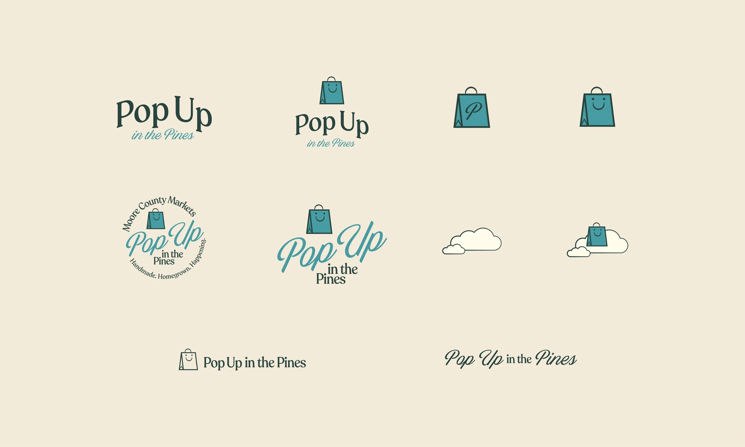
The logo suite for Pop Up in the Pines had to do something tricky: feel like it's always existed while still looking sharp enough to anchor a growing brand. We drew from vintage signage and classic Americana for the logo suite.
But the real star of the show is Baggie: our smiling shopping bag mascot that became the brand's beating heart. Our little character with a lot of personality shows up across the logo suite in multiple configurations! And we also created his best friend, a pint glass named Beerie.
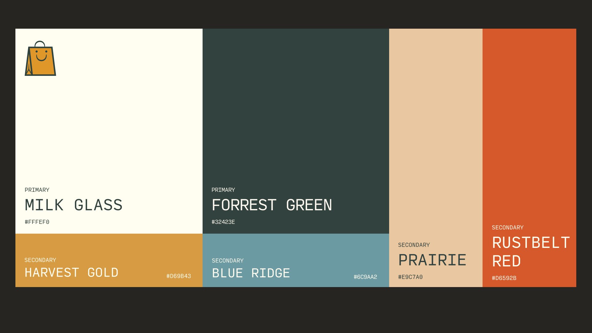
Color Palette
The color palette for Pop Up in the Pines is basically the feeling of summer camp. Every color name earns its place and together they read as warm, nostalgic, and full of character.
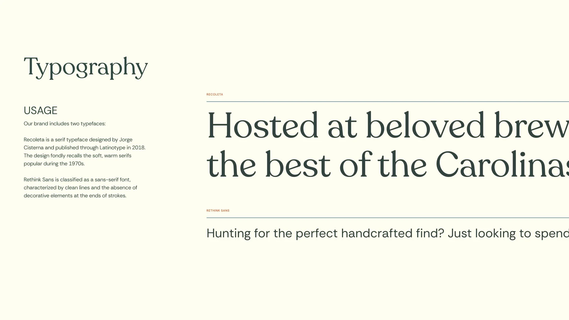
Typography
For headlines, we chose Recoleta, a serif that carries the soft, rounded warmth of 1970s typography without feeling costume-y. Rethink Sans balances it out: clean, modern, incredibly hard-working. The two work together the same way the brand does where there’s one foot in nostalgia, and one foot moving forward.
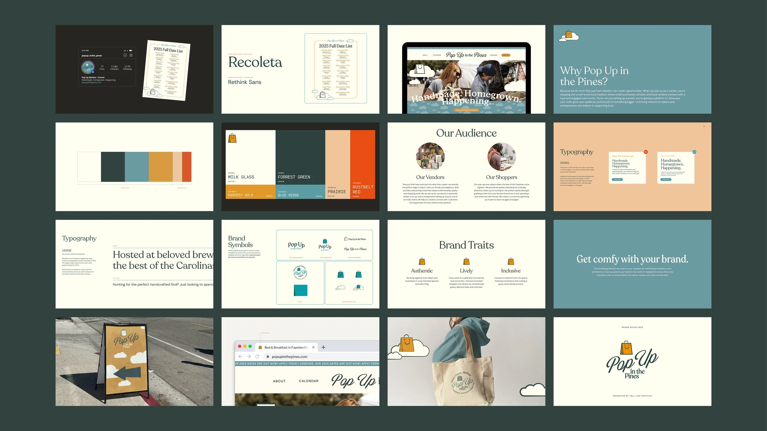
Brand Guidelines
The full system, documented. A comprehensive brand guide that ensures Pop Up in the Pines shows up with the same warmth, character, and consistency wherever it goes.