
Old World Massage Co Brand Identity & Website
Brand Identity
Website
Marketing Collateral
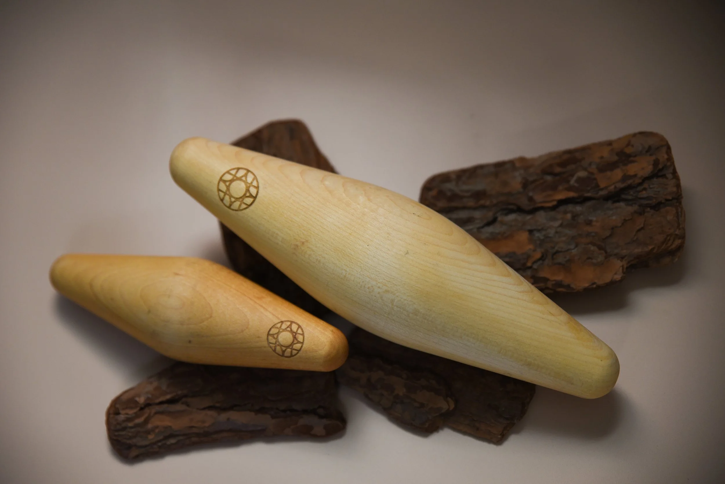
SCOPEOld World Massage Co. started with a simple observation: massage tools on the market weren't designed the way massage therapists actually work. So founders Dustin and Kaysha set out to create something better: a tool shaped by the natural curves of the human body, one that holds heat, fits intuitively in the hand, and moves fluidly with a therapist's touch. But when they reached out to us, their brand didn't yet match the thoughtfulness of their product.
We worked together to build a brand identity that positions Old World Massage Co. as leaders in their space. They now have a custom logo suite, strategic messaging framework, full visual identity, and a website that flows as beautifully as their signature Ebb and Flow massage tool. Every element now celebrates what makes them different. The smooth, intentional curves, and the focus on supporting (not replacing) the therapist's natural movement, and the deep understanding of how bodies and tools work in harmony.
“Trust us, it’s more than worth it. Julia has a magic power and after her work, it’s real. You can see the vision and it makes you want to keep going and going and going so your company will be successful. When the brand looks awesome, people trust it. Which makes your company successful.”
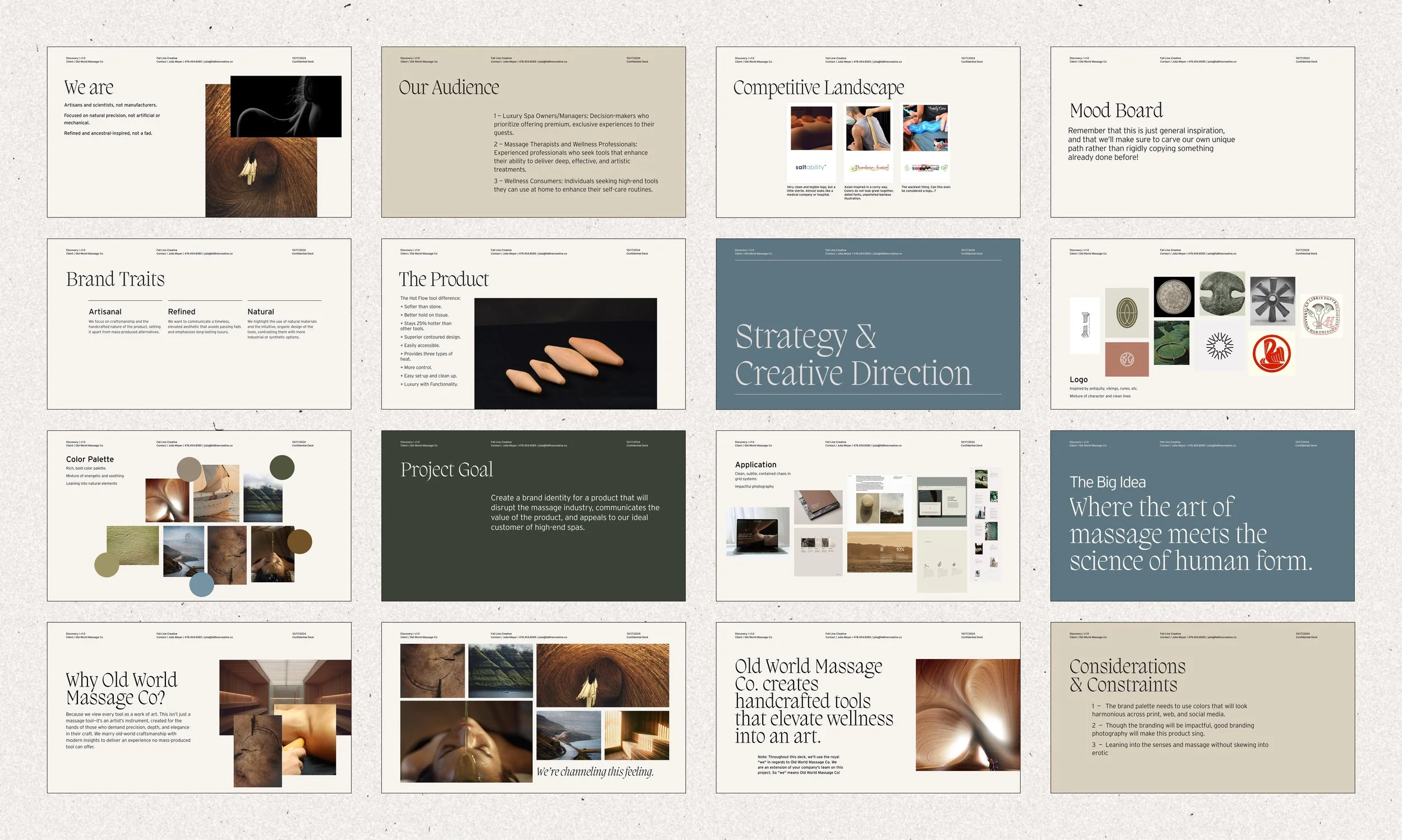
Brand Strategy & Positioning
Old World Massage Co. needed to carve out their own lane that honored both the artistry of massage therapy and the precision of biomechanical design. We identified their audience of luxury spa owners, experienced massage therapists, and discerning wellness consumers. They all value intentionality over convenience, craftsmanship over commodity.
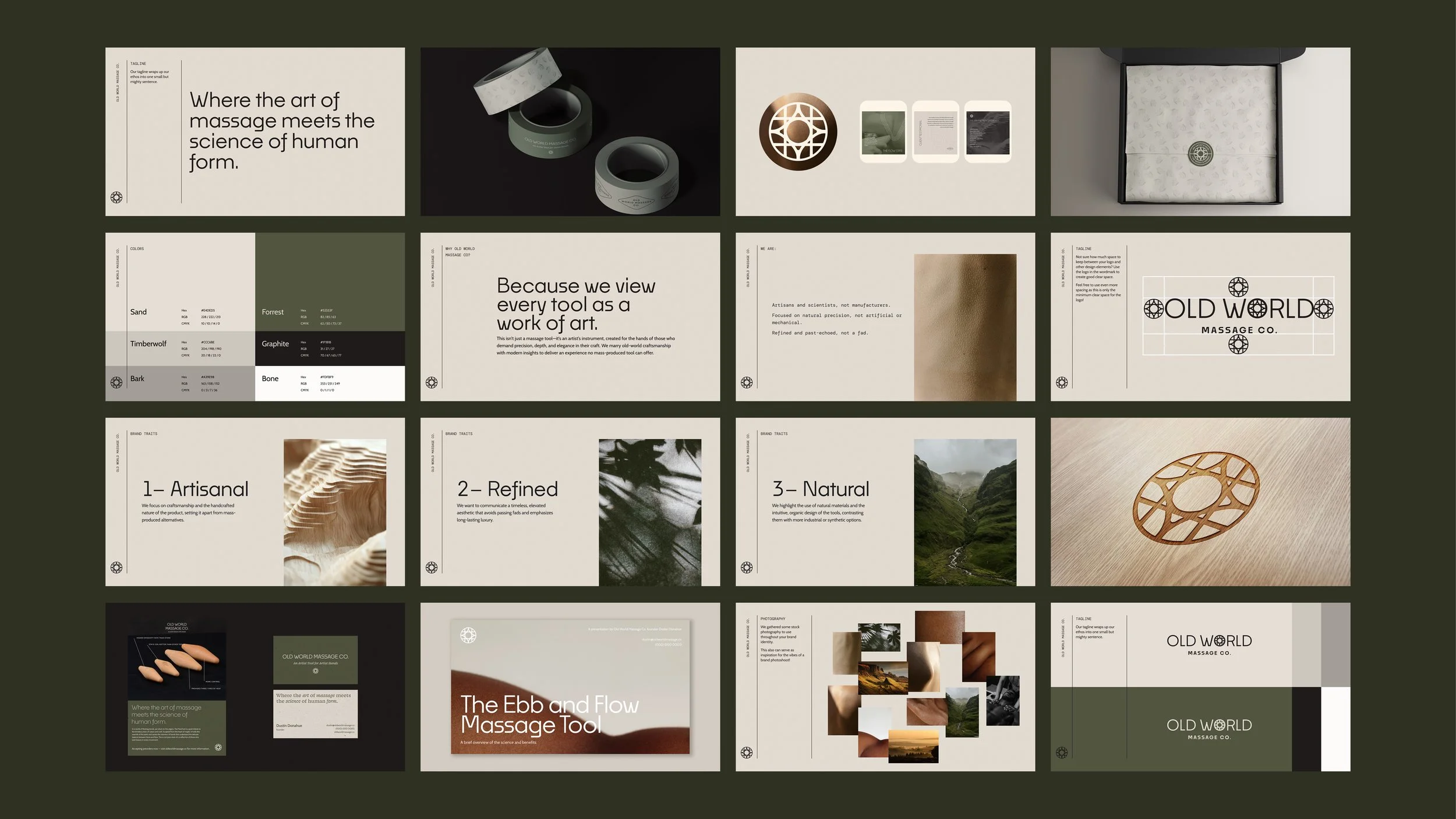
The big idea"Where the art of massage meets the science of human form" captures exactly what makes Old World different. We wanted to communicate how Old World Massage Co. views every tool as a work of art and an artist's instrument. The tool they’ve created is truly created for the hands of those who demand that perfect mix of precision and elegance.
Visual Identity
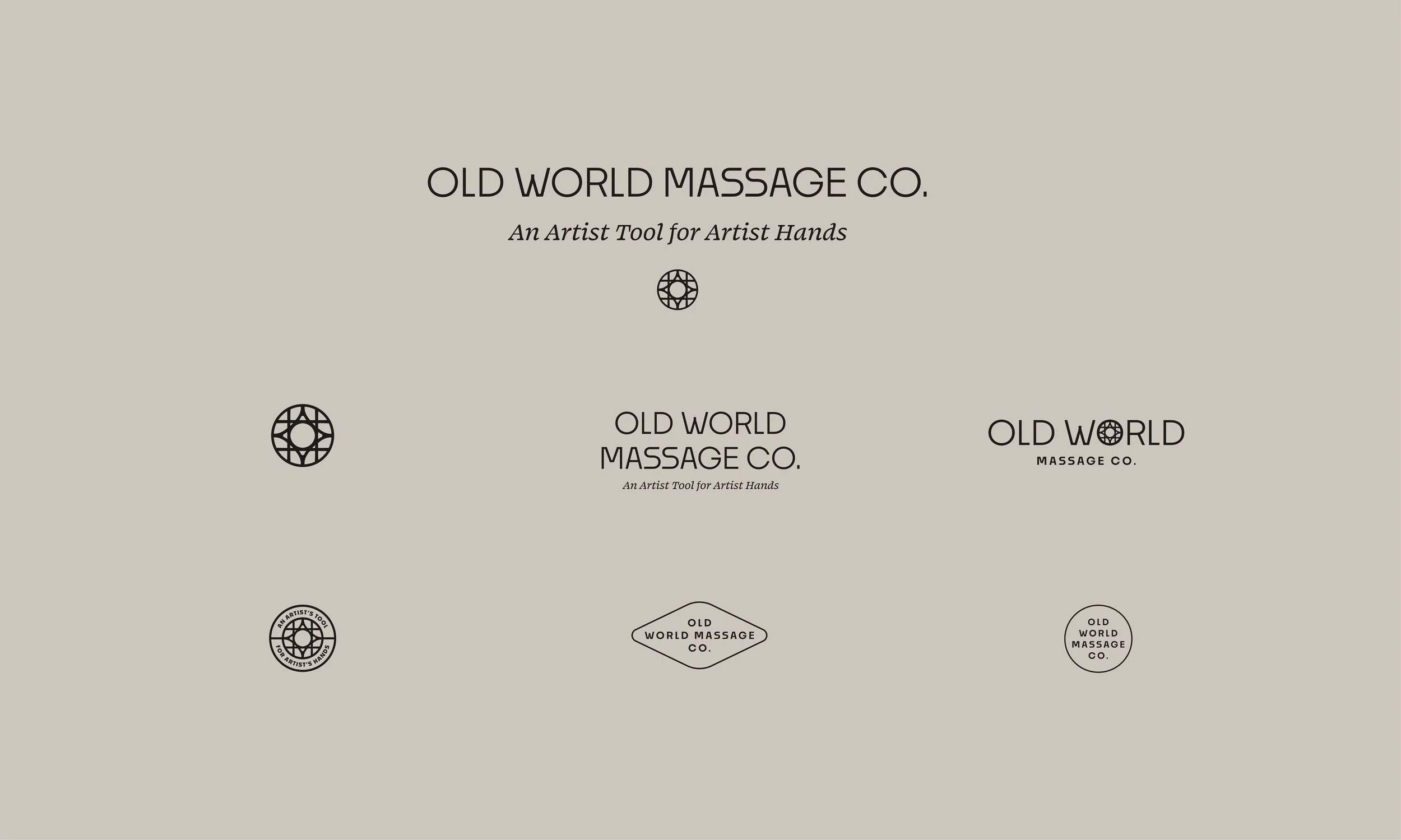
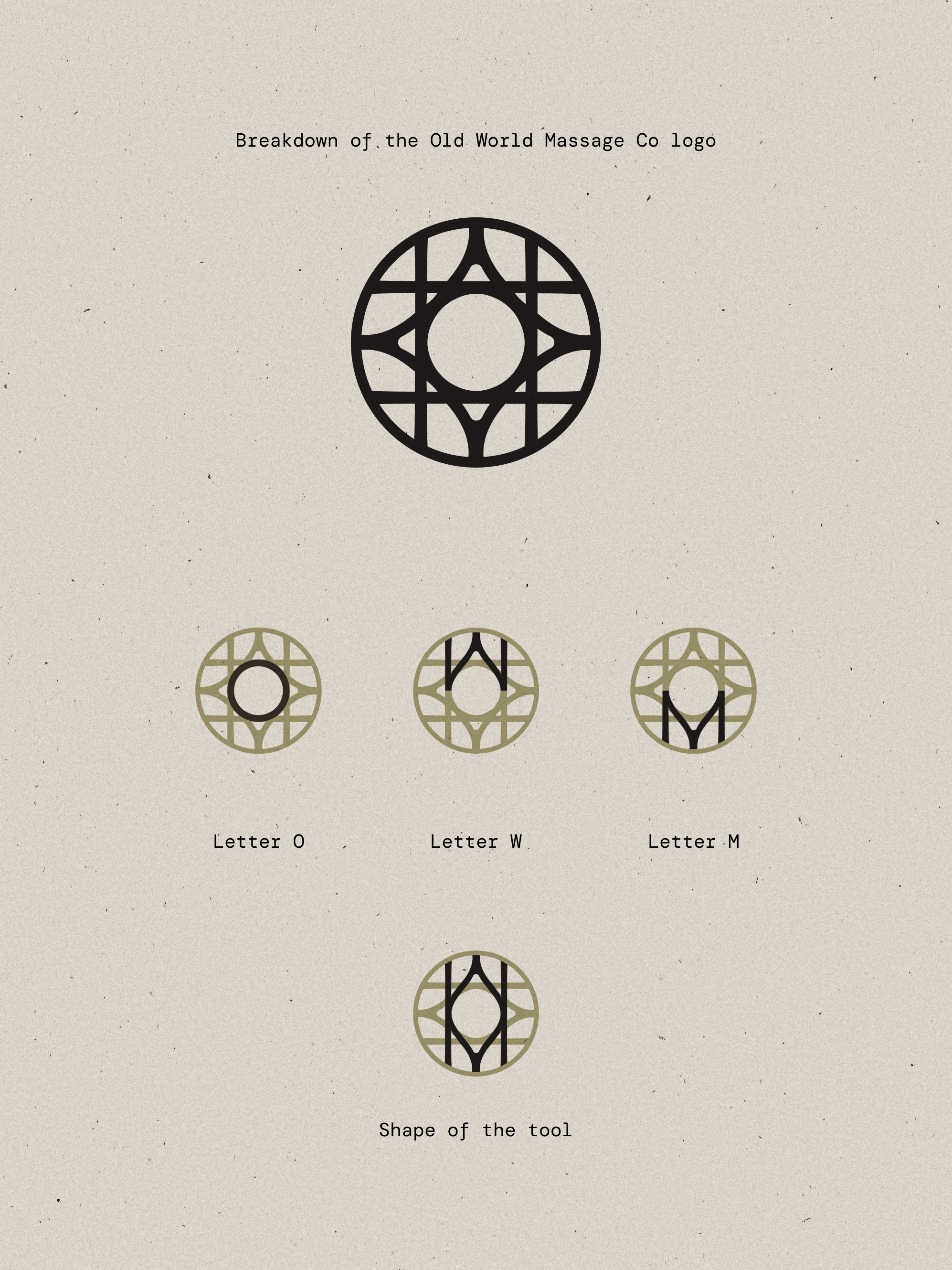
The logo tells the story of ancient wisdom and modern innovation. We looked to inspiration like ancient runes, tapping into that subconcious timeless knowledge of the human body and the centuries—old art of massage. The circular mark we created feels both old and new at one, feeling grounded in tradition while signaling a forward-thinking approach.
But here's where it gets good: the logo has the letters O, W, and M woven seamlessly into the geometric pattern. And you can also find shape of the Ebb and Flow massage tool abstractly represented within the mark's structure. It's a brand monogram, product symbol, and ancient-inspired emblem all in one.
Where the logomark nods to old-world craftsmanship, the typeface pushes forward: sleek, modern, precise. The tension between ancient and contemporary mirrors exactly what Old World Massage Co. does.
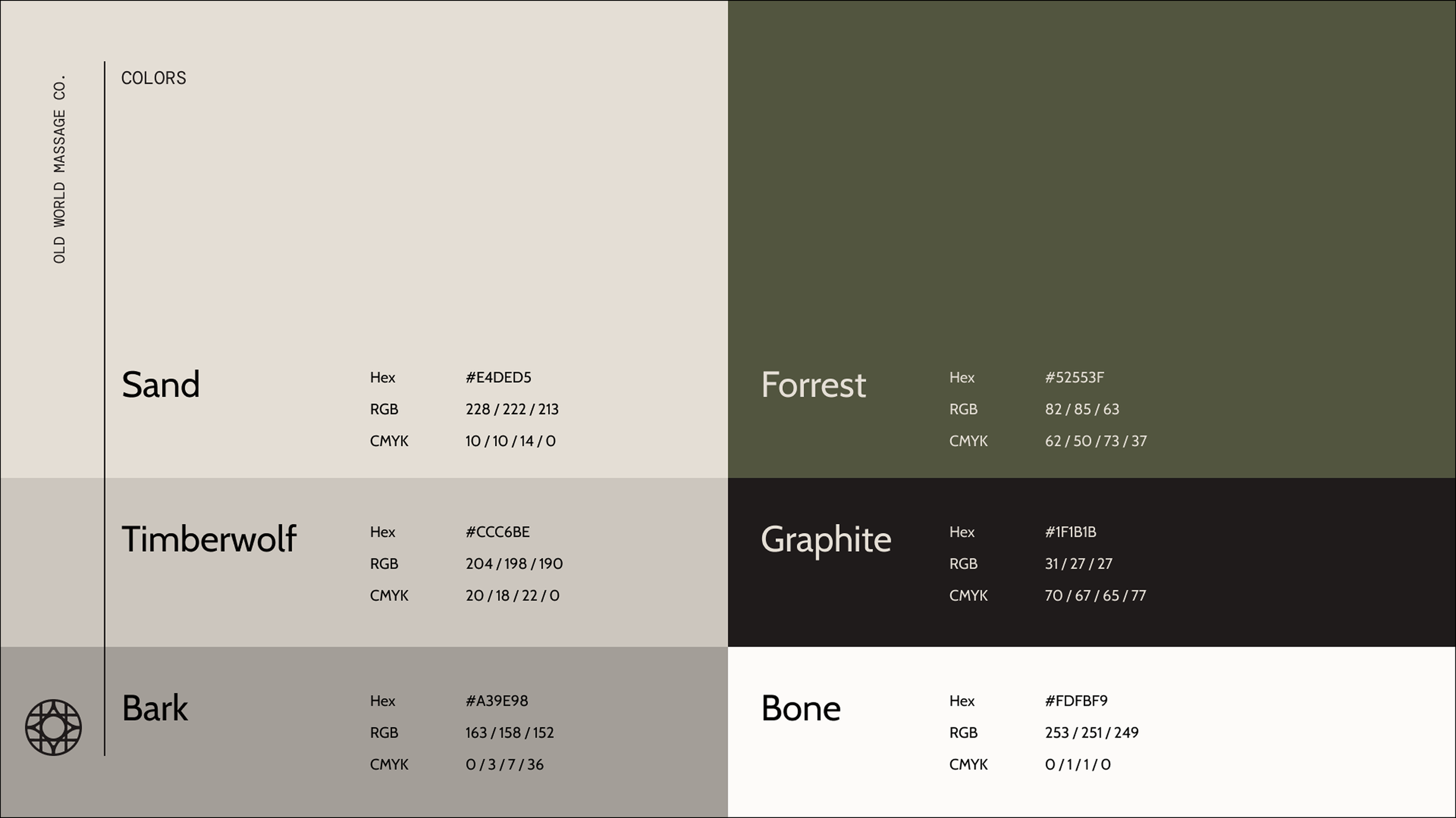
Color Palette
The color palette grounds the brand in the natural world. We built it around earthy neutrals that evoke the materials massage therapists work with: skin, stone, wood, natural fibers. These warm, organic tones feel tactile and grounded, reinforcing the handcrafted nature of the tools.
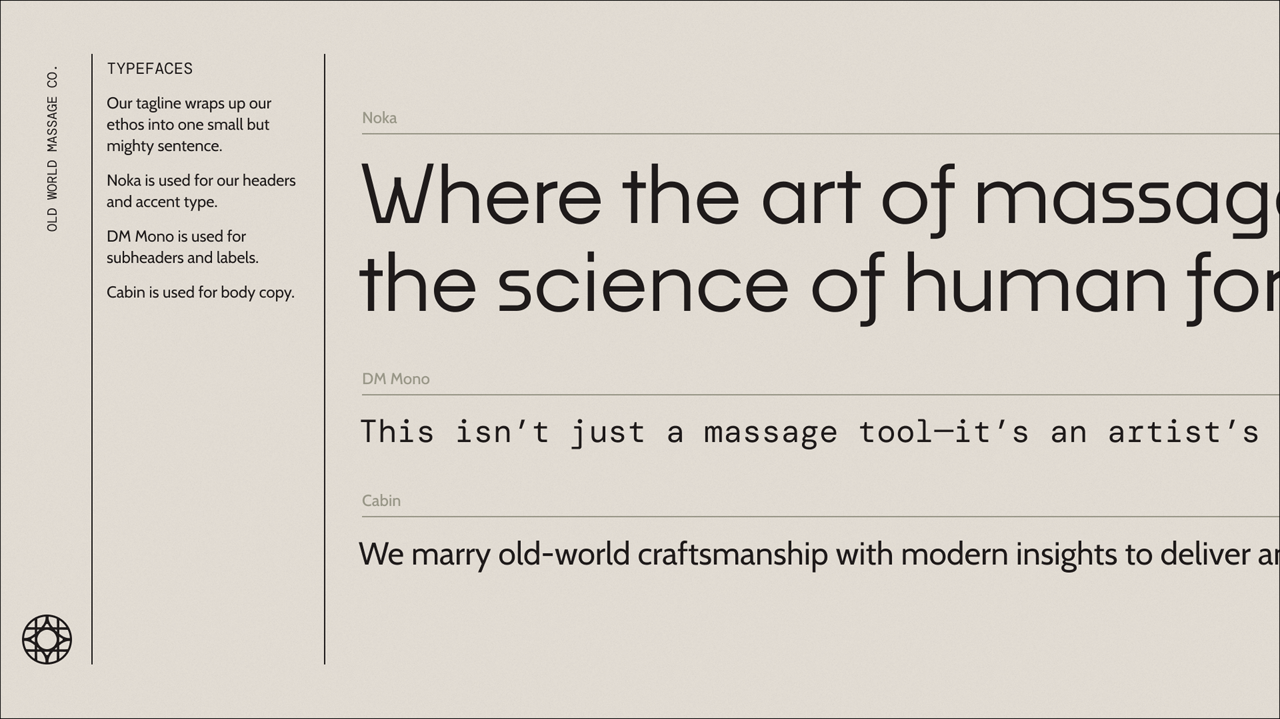
Typography
The type system does double duty: honoring tradition while signaling precision. Noka, a modern geometric sans, projects clean, contemporary confidence. DM Mono feels methodical, intentional, and exact. And Cabin rounds out the system, offering warmth and readability without competing for attention. Together, the typefaces create a hierarchy that's bold when it needs to be, detailed where it matters, and always easy to read.
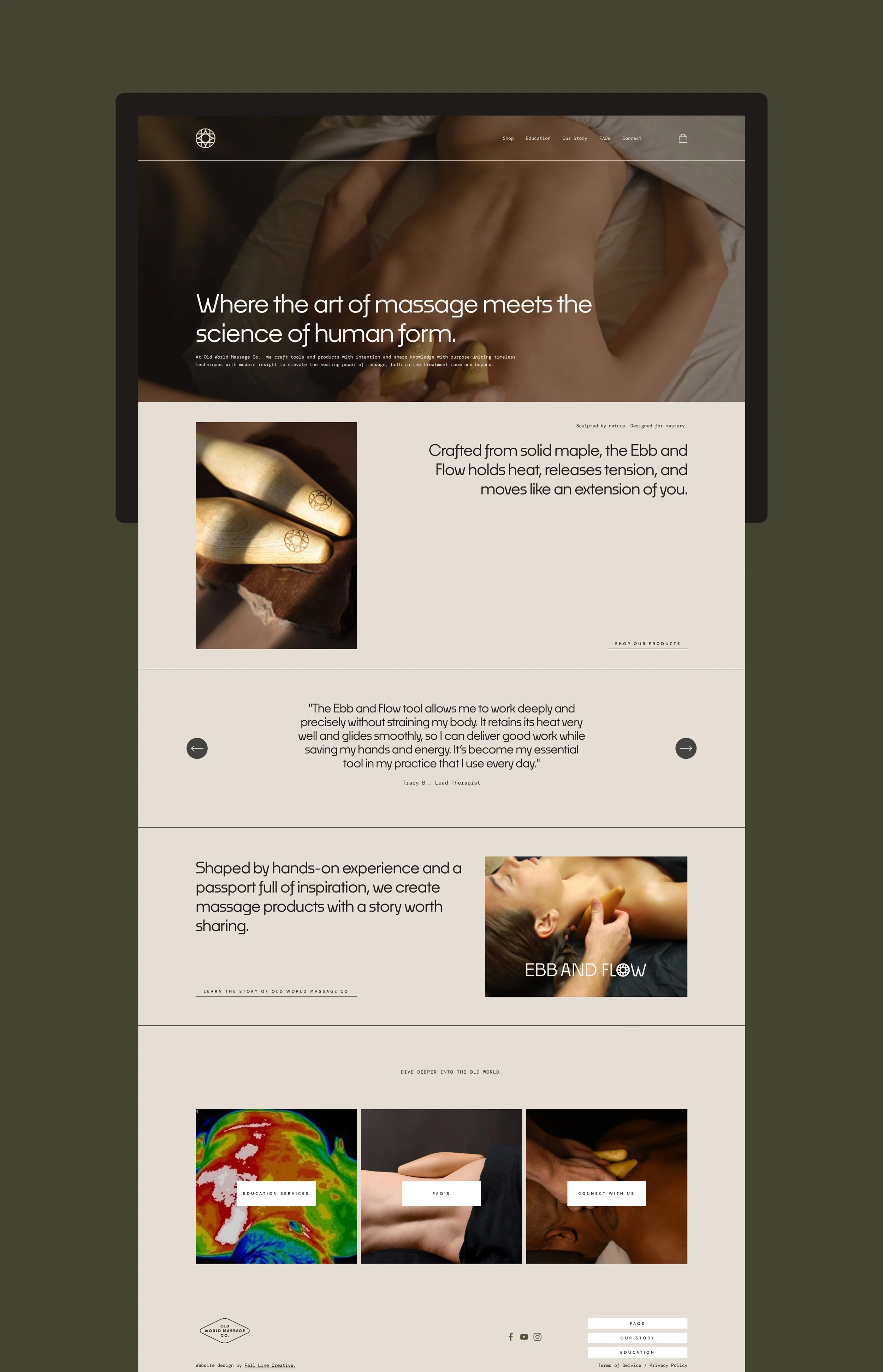
Web Design
We built the website to do the heavy lifting of positioning Old World Massage Co. as both a premium product brand and an educational resource. Built on Squarespace for ease of management, the site balances e-commerce functionality with content that establishes the founders as thought leaders in their space.
We leaned into generous white space and large, cinematic product photography. The site flows intuitively into different sections: shopping the products, learn about the science behind them, explore upcoming events and workshops, etc. Every element reinforces the same message: Old World Massage Co. is advancing the craft of massage therapy.
Product Branding
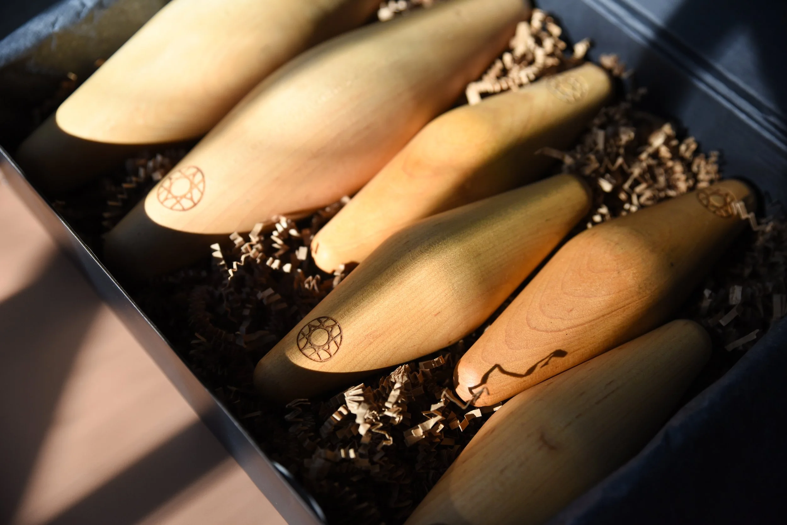
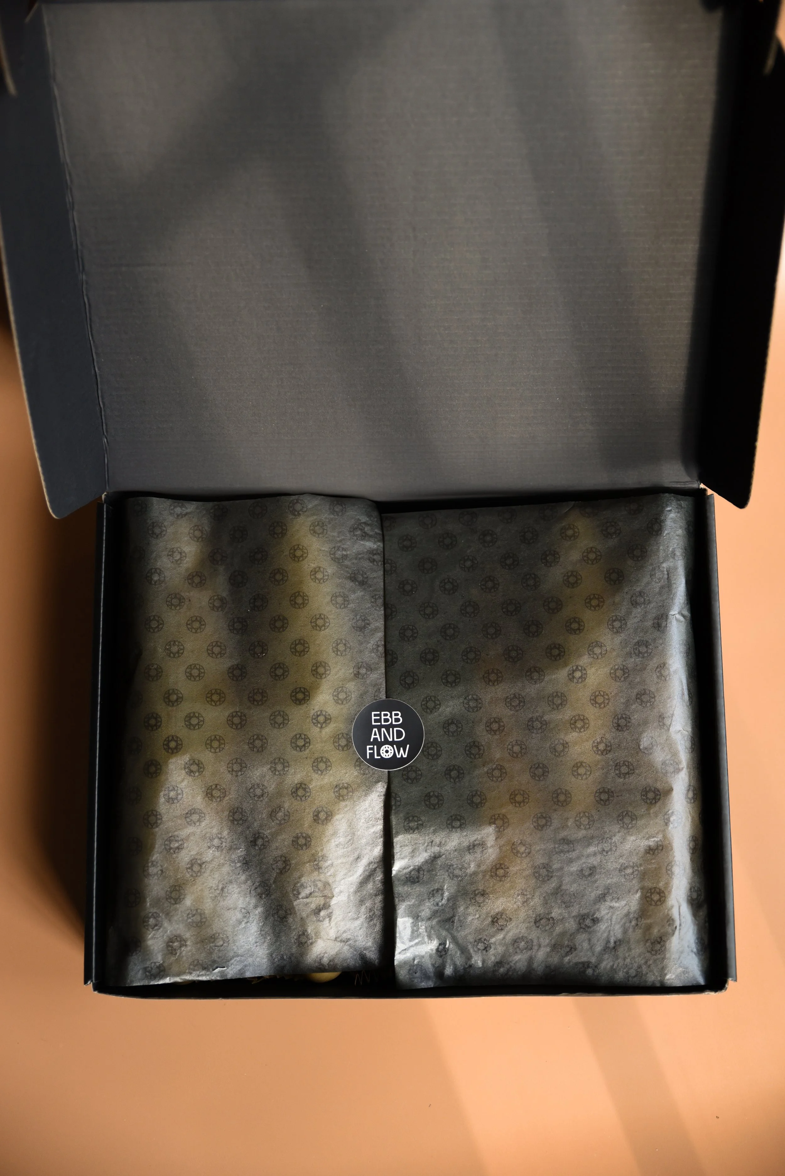
The logo lives directly on the massage tool, laser-etched into the maple wood as a mark of craftsmanship. Very refined and subtle, just enough to remind the user that they’re working with something made with care.
Custom tissue paper shoes a repeating pattern of the logo, and a branded sticker seals each package.
Brand Guidelines
The full system, documented. A comprehensive guide that ensures Old World Massage Co. shows up consistently and powerfully everywhere they go.