
Batten Court Design Brand Identity & Website
Brand Identity
Website
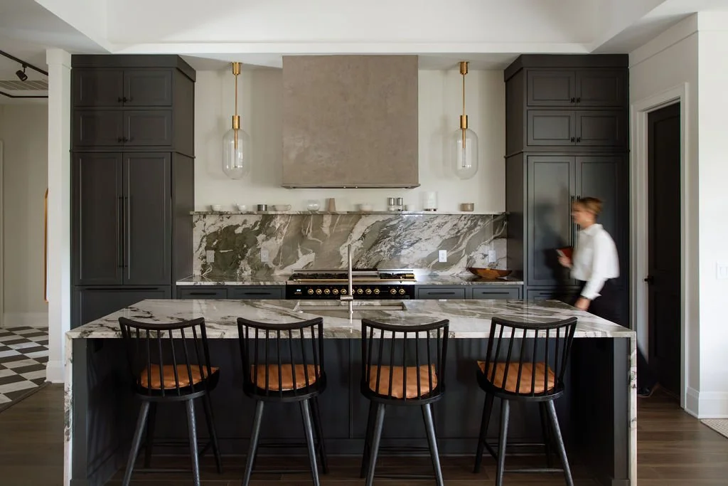
SCOPEBatten Court Design had a problem most designers would envy: they were doing exceptional work, but their brand wasn't showing it. Led by founder Elizabeth Valkovics, the Pinehurst-based firm brings over 20 years of international design expertise (trained at London's Interior Design School, award-winning hospitality projects, the whole nine yards) to high-end residential and hospitality spaces across the Carolinas. But their visual identity wasn't wuite holding up its end of the deal.
The bones were there. We just needed to give the brand and website a good polish. And the brand and website we created feels as refined as the spaces Batten Court creates.
Brand Strategy & Positioning
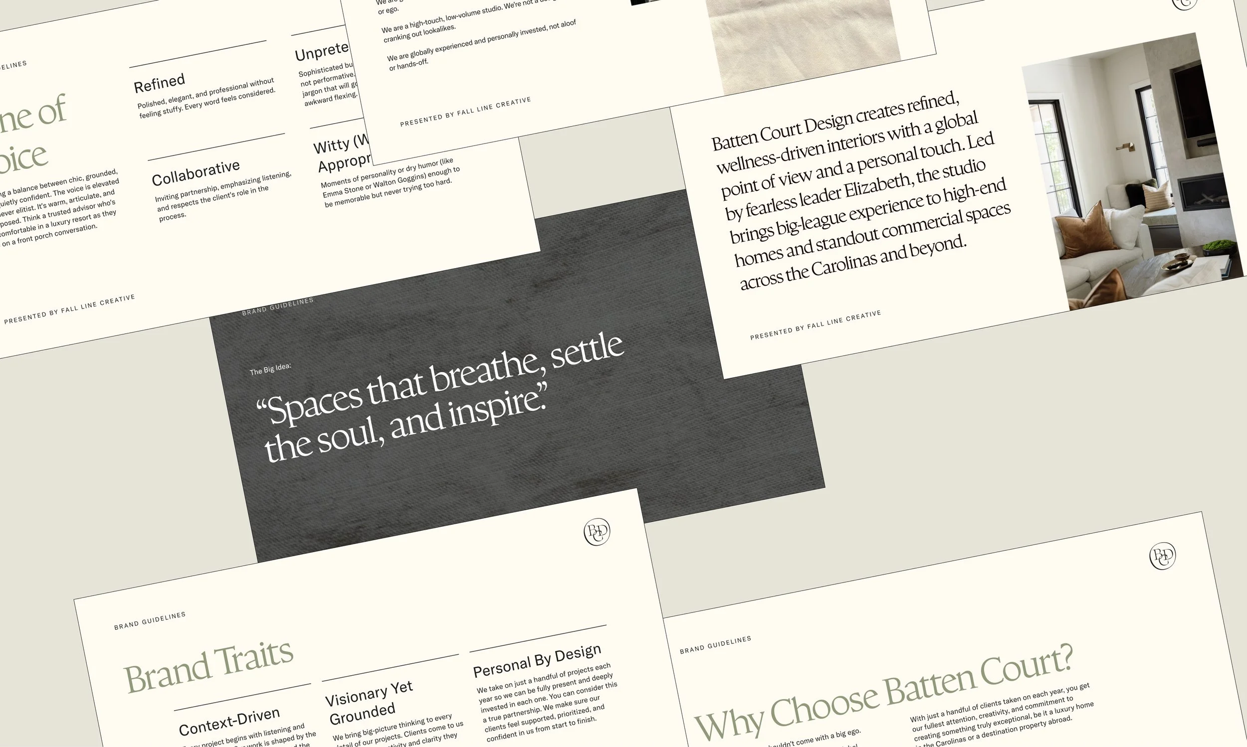
We crafted a positioning strategy that made them distint from the sea of interior designers shouting “We’re luxury!" “We’re custom!” The challenge was communicating their genuinely different approach, rather than proving their expertise. So we dug into what Batten Court does: bring the kind of high-level hospitality design experience you'd expect from a designer who's led award-winning international projects, but they apply it with a wellness-first, ego-free approach.
From there, we built the strategic foundation. The tagline "Spaces that breathe, settle the soul, and inspire" captures both the focus on wellness and the emotional impact of their work. We wanted to communicate taht big design doesn't have to come with a big ego. This clarity became the backbone of everything.
Visual Identity
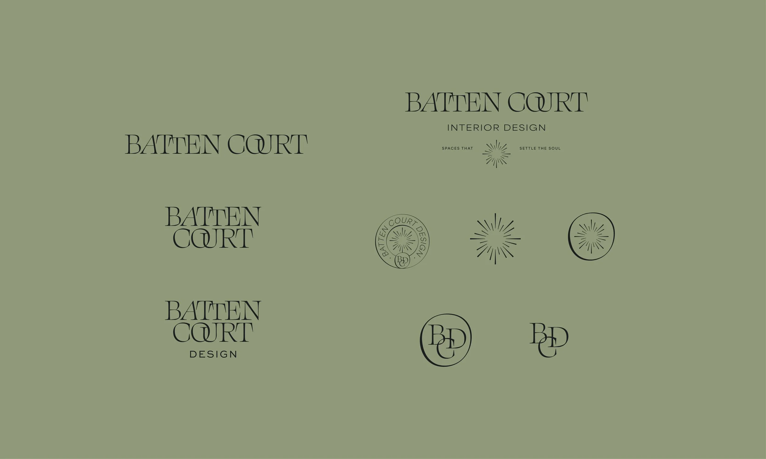
We wanted a logo that could hold its own in the luxury interior design space without relying on tired tropes. The custom wordmark features a refined serif with distinctive linked letterforms. It's editorial, sophisticated, and it stands out without looking like it’s trying too hard.
The starburst icon draws from art deco geometry, referencing the kind of architectural details you'd find in the refined, globally-influenced spaces Batten Court creates. This isn't a logo that will feel dated in five years. It's built to grow with the firm as they take on bigger projects and expands their reach.
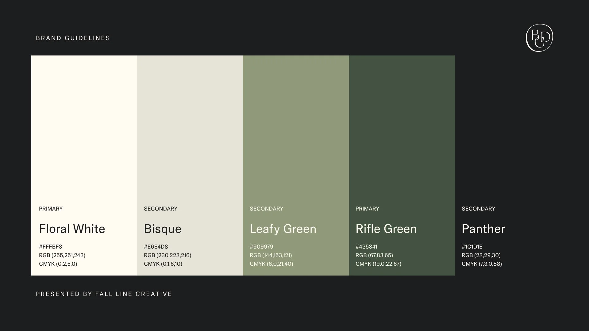
Color Palette
That dramatic, deep hunter green is rich and grounded. That was our starting place! From there, we built out supporting tones that breathe: soft greens and warm neutrals. Together, the palette feels like walking into a beautifully designed room where every material was chosen with intention.
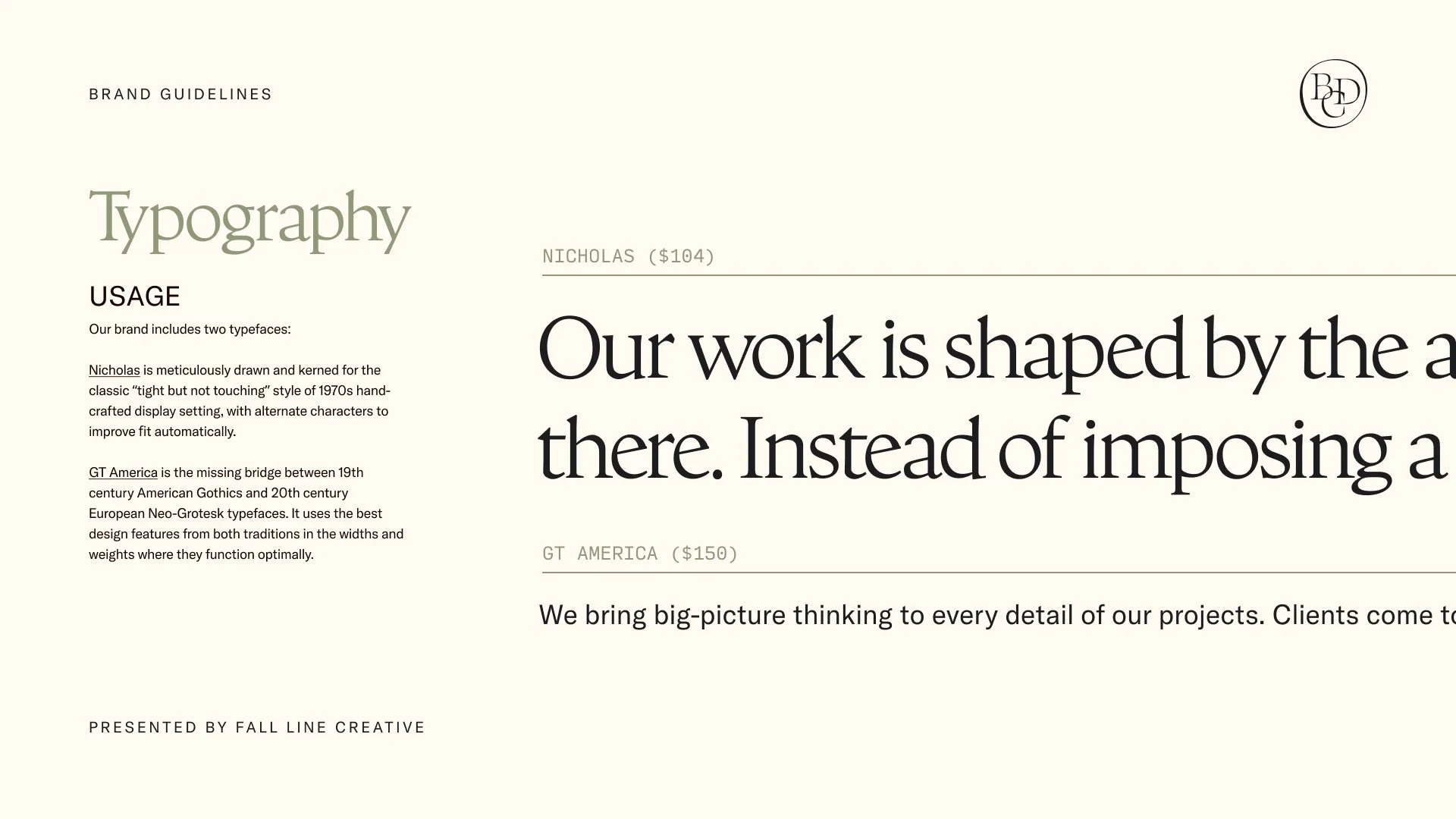
Typography
The type system needed to feel as considered as the interiors Batten Court designs. We wanted it to be sophisticated but not showy, with just enough personality to be memorable. Together, the pairing creates that editorial balance: Nicholas makes a statement where it needs to, GT America does the heavy lifting everywhere else.
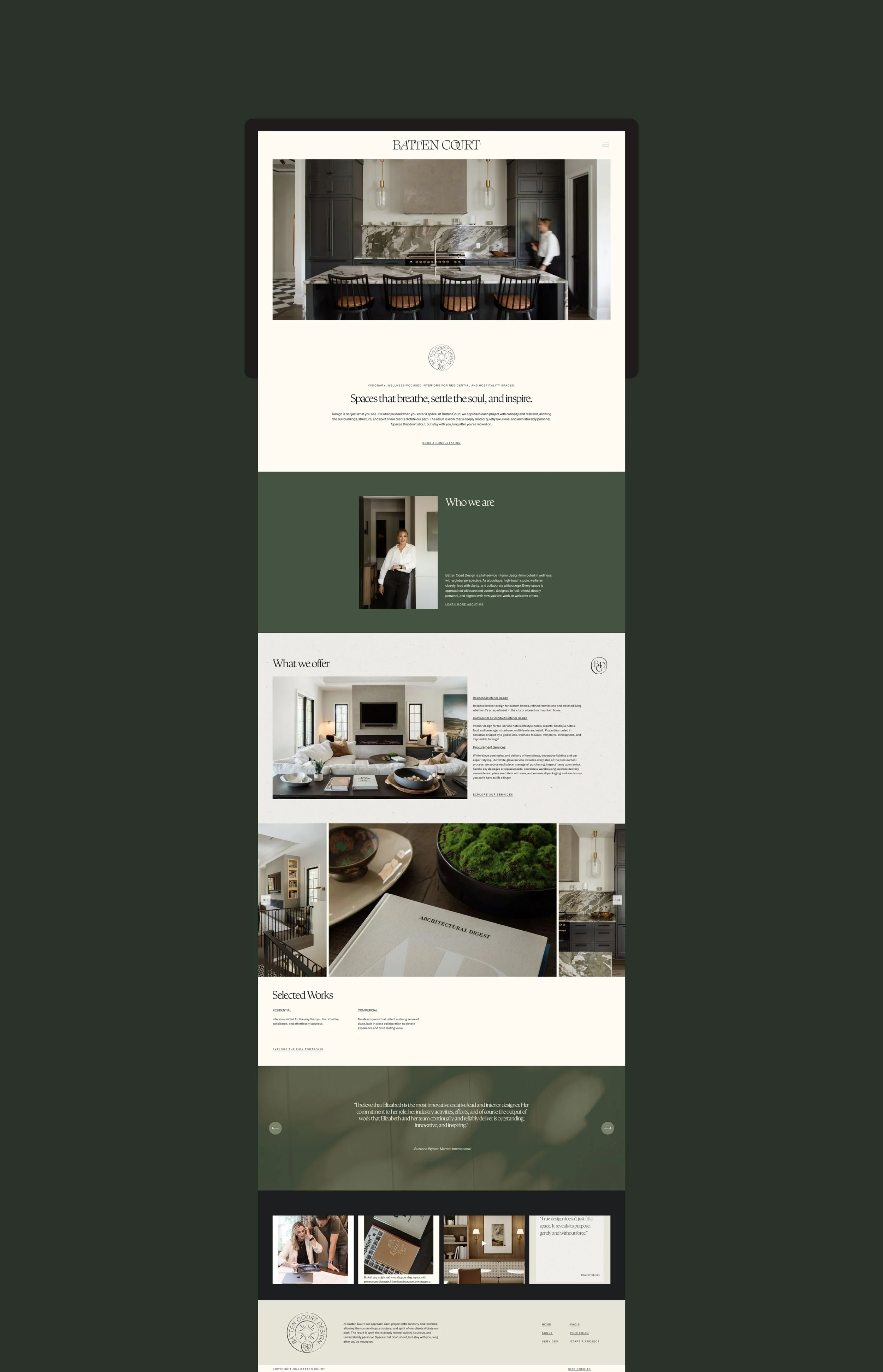
Web Design
The website needed to do two things exceptionally well: showcase Batten Court's stunning portfolio and convert the kind of high-end clients who expect both expertise and a personal touch. Built on Squarespace for easy content management, the site feels more like flipping through an architecture magazine than browsing a typical design firm website.
Large, full-bleed photography, generous white space and that editorial type system reinforces that "spaces that breathe, settle the soul, and inspire" positioning without having to say it twice.
We also brought in Dannyelle of Stellar Strategies Creative to optimize the site for SEO!
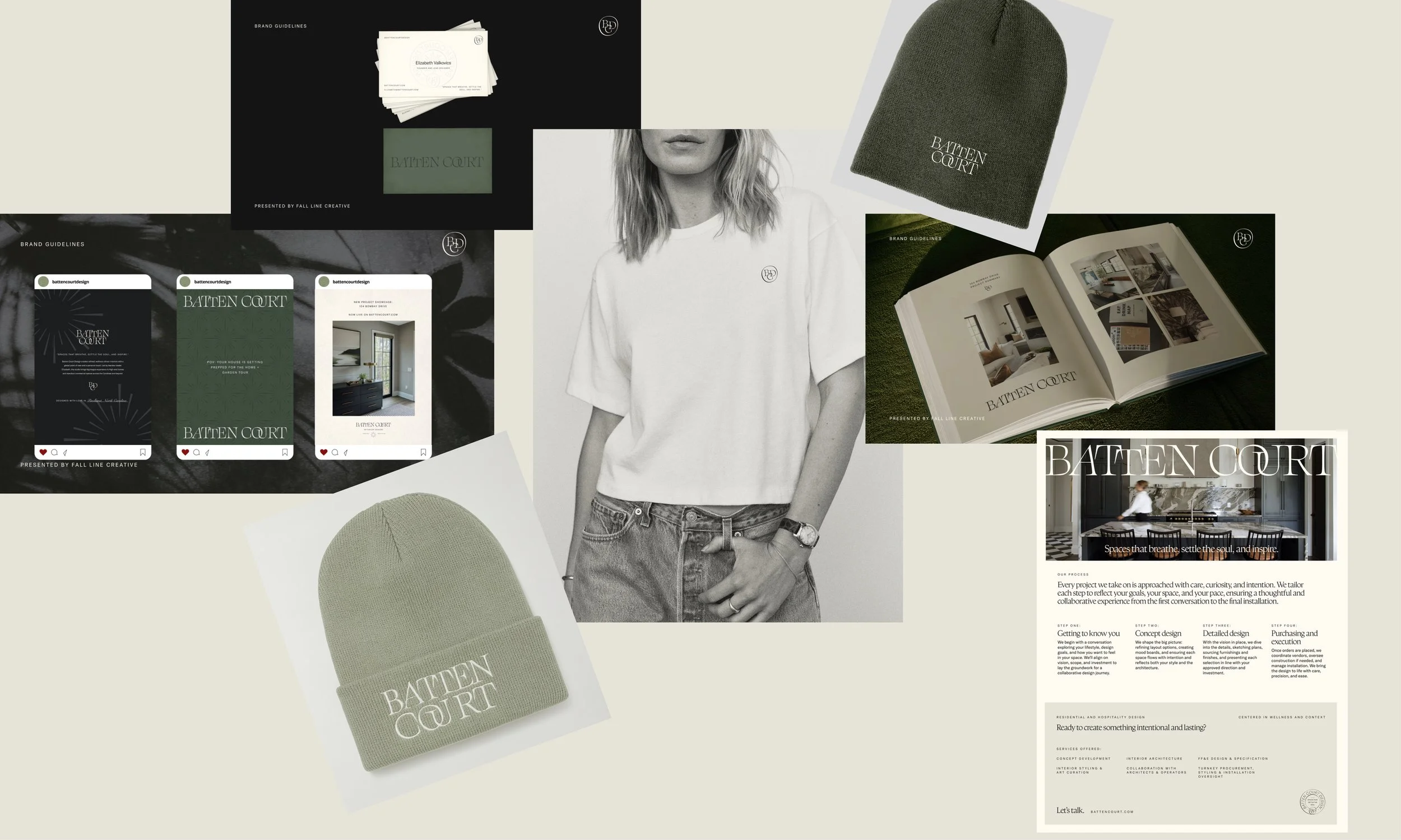
Applications
We made sure the brand identity system worked seamlessly in the real world across all touchpoints: Business cards and stationary, apparel, social media templates, the works. Every piece reinforces that editorial sophistication.
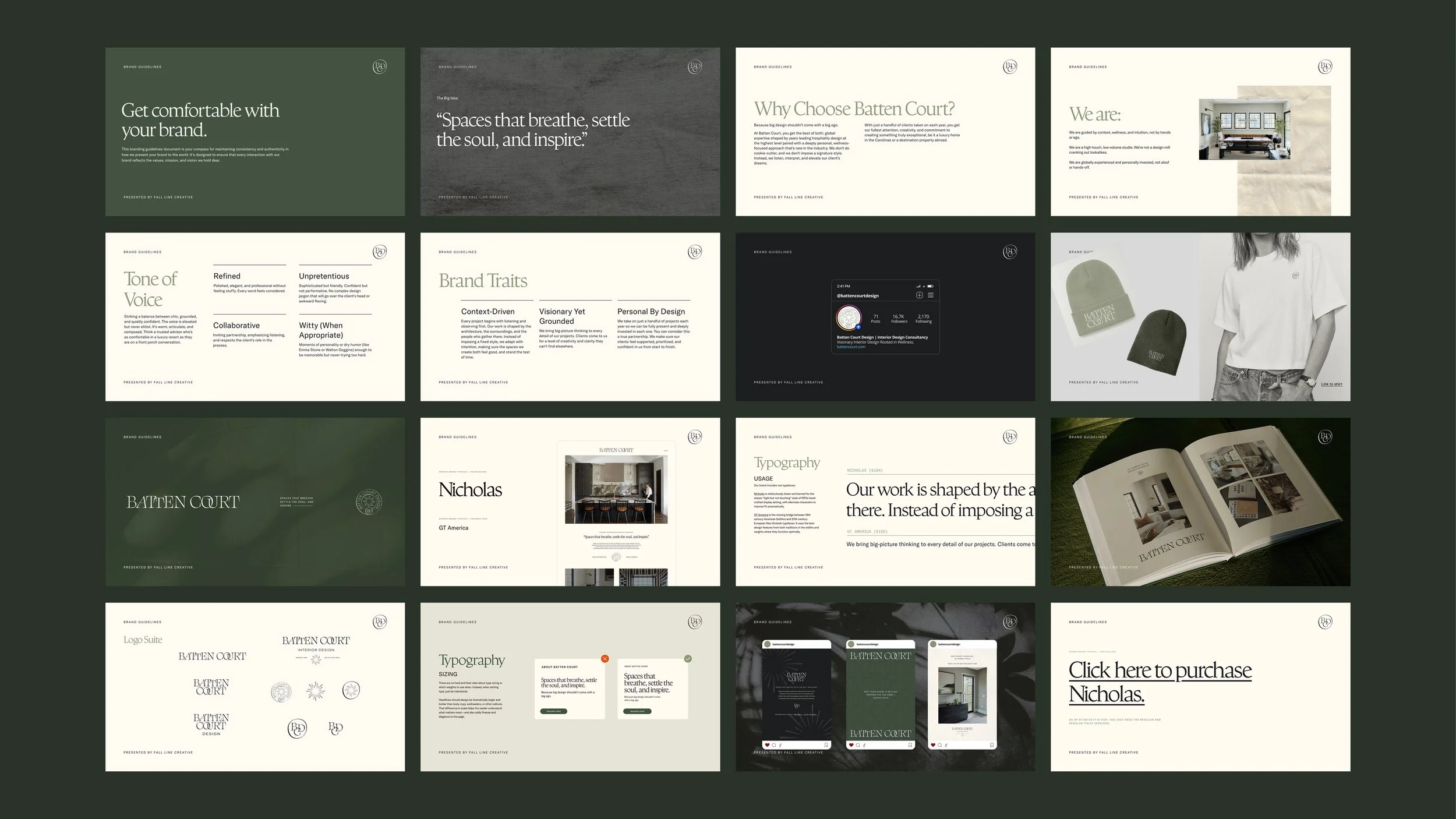
Brand Guidelines
The full system, documented. A comprehensive guide that ensures Batten Court Design shows up consistently and powerfully everywhere they go.