

The Corner Collective Brand Identity
Brand Identity
Apparel Design
Marketing Collateral
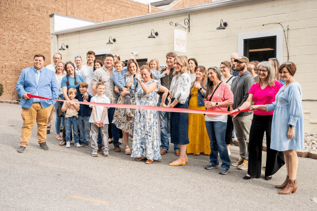
SCOPEThe Corner Collective came to us ready to launch Southern Pines' first true coworking space. Their vision: A vibrant hub where remote professionals, entrepreneurs, and local businesses could connect, collaborate, and create, not just another coffee shop with WiFi.
Southern Pines didn't have an established coworking culture yet. They needed a brand that could attract a diverse community, from creatives to corporate remote workers, while positioning themselves as the heart of innovation in a small but mighty town.
They needed to look professional enough for established businesses but welcoming enough for solo entrepreneurs testing the waters. And they needed to do it before anyone else claimed that space.
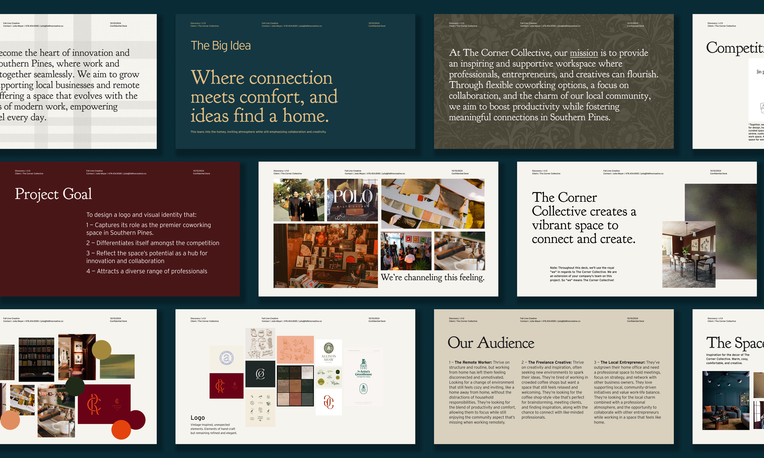
Brand Strategy & Messaging
Brand Positioning: The heart of innovation and collaboration in Southern Pines
Key Messaging: "Where connection meets comfort, and ideas find a home."
Tone of Voice: Warm, vibrant, community-focused. Professional without being corporate or sterile
Target Audience: Remote professionals, local business owners, creatives, and entrepreneurs who want community
Differentiation: Intentionally local (growing with the town) vs. franchise coworking chains
We built the entire brand around one insight: coworking isn't just about desks and WiFi. It's about creating a space where work and community come together seamlessly. The Corner Collective needed to feel like a natural gathering place, not a sterile office rental.
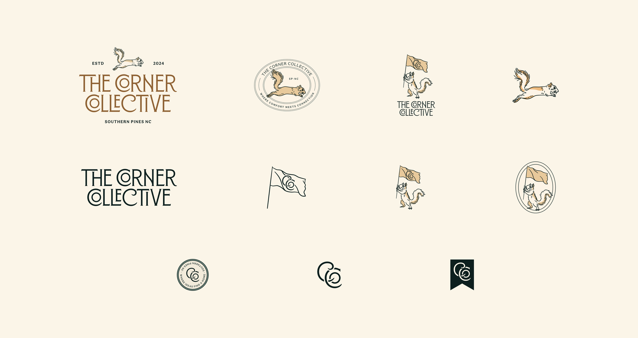
The Visual Story
The brand identity is anchored by Coco, the beloved squirrel mascot who's become the beloved face of the brand.
Why a squirrel? Because squirrels are resourceful, community-oriented, and quintessentially local to Southern Pines. Just like the people who work at The Corner Collective. Coco appears throughout the brand in playful ways, giving the brand approachability and charm without sacrificing professionalism.
We made sure the system was extremely flexible so the brand can adapt to any application while remaining cohesive and unmistakable.
All this combined became a brand that feels like your neighborhood third place. Welcoming enough for your first day of coworking, professional enough for your most important client call.
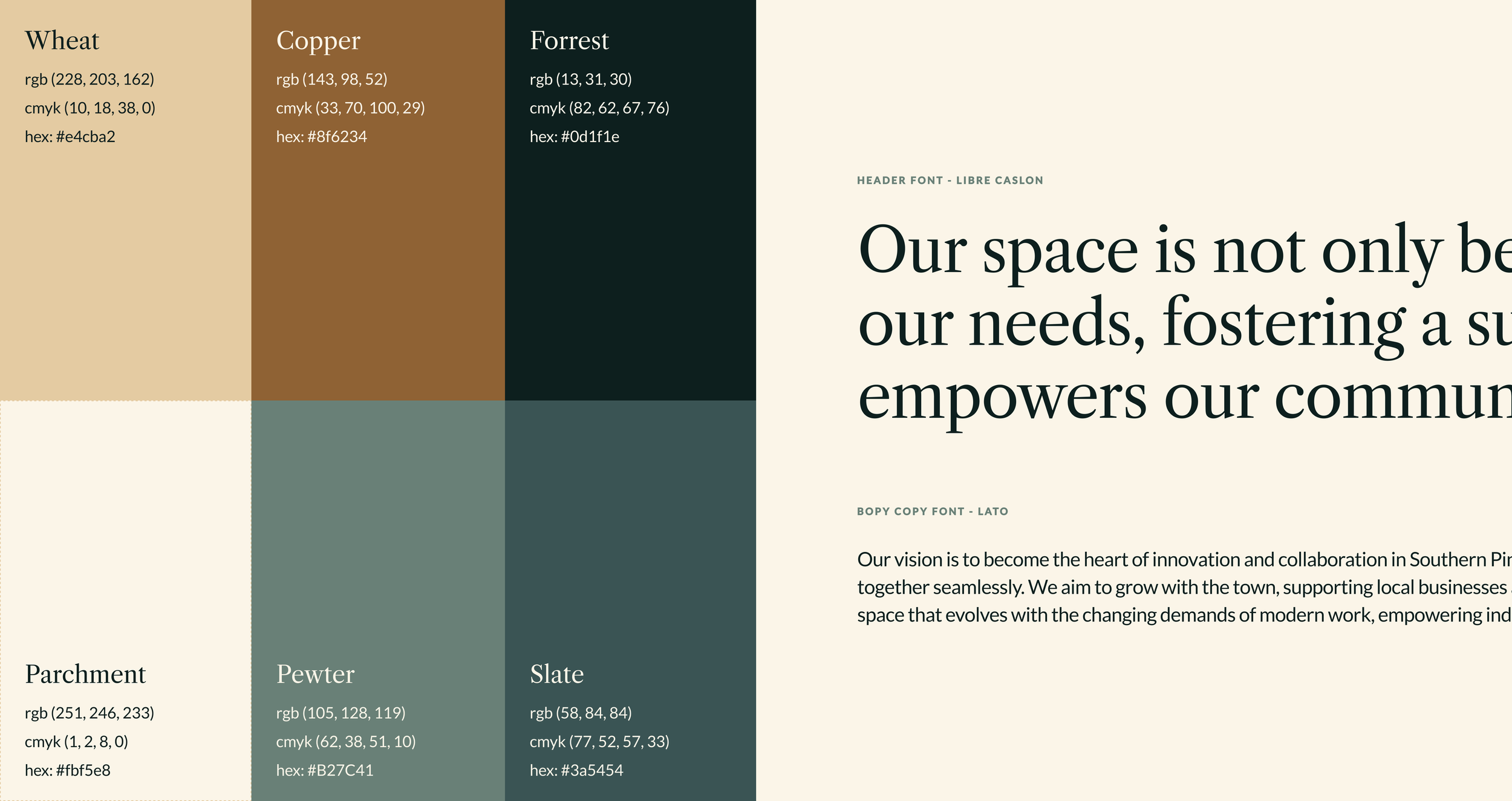
Brand Color Palette and Typography
The earth-toned palette of warm terracottas, sage, cream, and deep teal creates the cozy-bookshop-meets-professional-workspace vibe they needed. Clean, geometric typography in the wordmark keeps it polished and legible, while the hand-drawn illustrative elements add warmth and character.

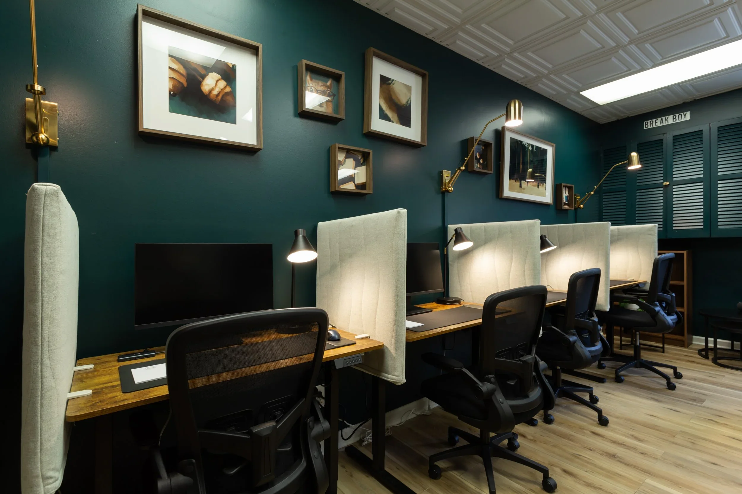
Signage and Placemaking
For the Corner Collective, we were also able to translate the brand into an experience. We helped the team select paint colors throughout the space to reinforce the brand palette and create focus and calm. We also created custom artwork based on the brand identity which are now framed pieces hung throughout the space.
Now walking into The Corner Collective feels like walking into the Corner Collective. A space with personality and intention, and a brand that lives in every detail.


Merch
Tonal embroidered sweatshirts, tumblers, koozies, hats, journals… You name it, The Corner Collective made it!
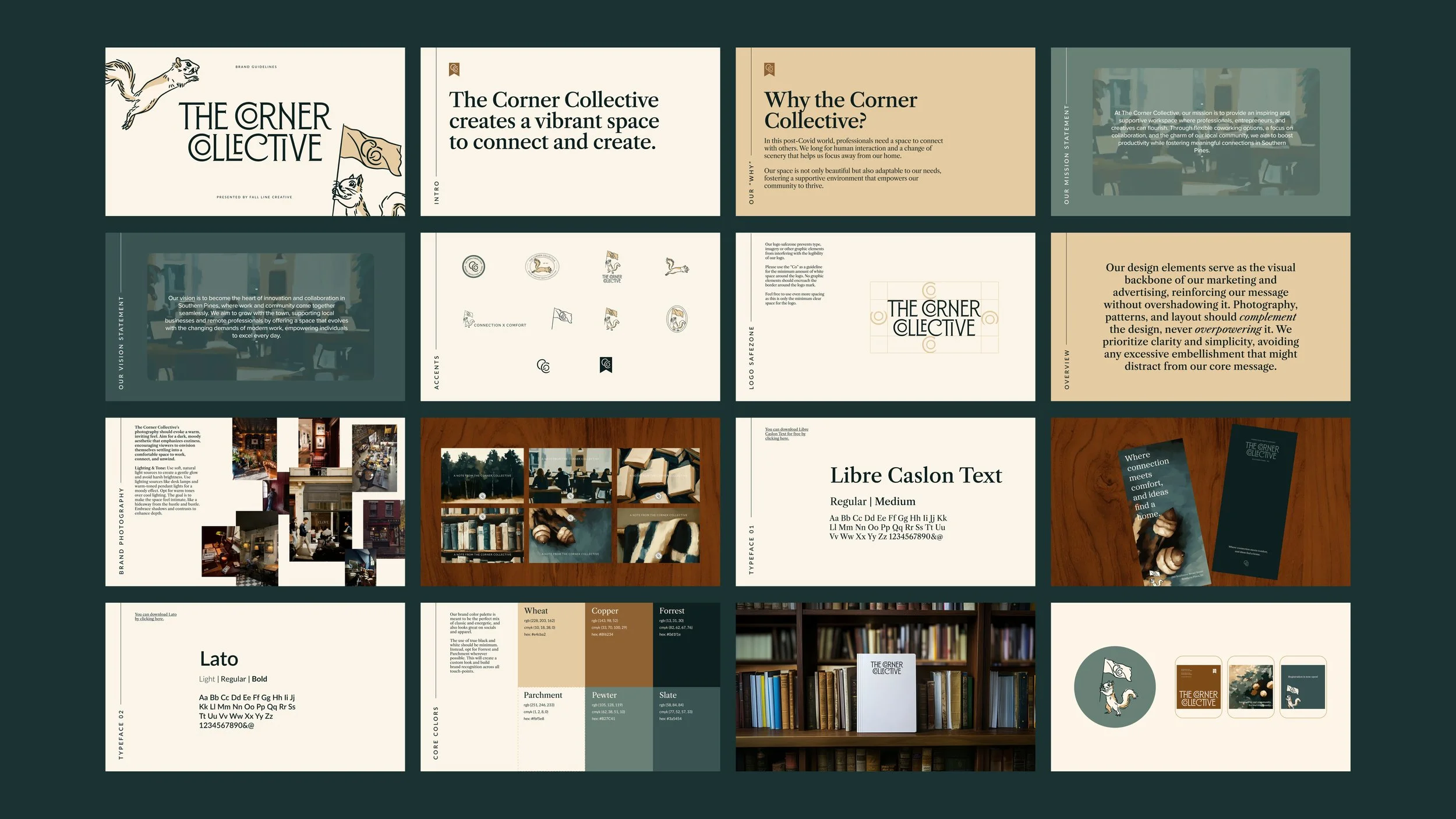
Brand Guidelines
And finally: brand guidelines. The playbook that keeps Coco and the Corner Collective showing up consistently, confidently, everywhere.